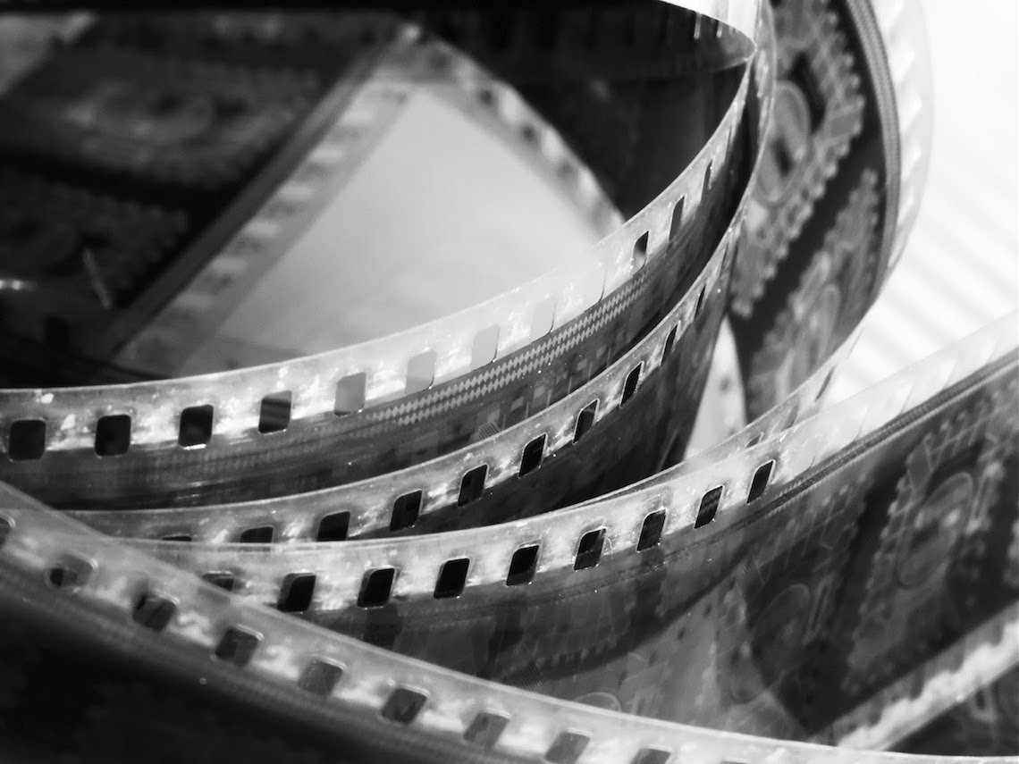
An action, act, or scene must somehow transition. This is where an array of specific cuts can call into play.
More than taking the bulk of footage and splicing it apart and composing it together; editing is diverse. The editor’s assembly line can manipulate time, space and visuals. An editor has the ability to enhance plot twists, ensure the coherence of plot and can create something pictorially with a unique texture. Editing can be seen as both supplemental to, and in service of the narrative itself. It can also be used to disconcert an audience alike.
Where do we possibly begin?
Graphic/match-cuts or graphic continuity/dis-continuity, jump-cuts, match-on-action and eyeline-matches, are but a handful of techniques used. But when it comes to graphic-matches, these are are the techniques which blend the technical with the artistic. And though sometimes overused like many other approaches, they often becomes ones that are admired for their artistic influence upon filmmaking.
A graphic-match can rhythmically transport the viewer from earth to space or from 1907 to 2029 using one consistent visual element. It can stitch together opposing or corresponding ideas and it can show change.
But where, and should we draw a line between analysing the editing techniques beyond a means to get to the next part? Is it always in service to the narrative or does the art of editing take over?
Whilst some filmmakers shy away from editing as an artistic element, others utilise the possibilities, often to a degree whereby the editing itself becomes a strength of the finished medium. It therefore becomes its own art form.
Open a discussion on match-cuts and wait for the film-enthusiasts to race you in mentioning 2001: A Space Odyssey. Supposedly the most famed and noted of its kind is a shot whereby a bone and the space station are united over two scenes. Essays have been written alongside blog-posts, forum posts and podcasts recorded. One can only assume that an array of Tweets, Facebook statuses and private messages have followed as it has been analysed, appreciated and dissected throughout film studies and pass-times alike.
Within my own film studies, Bordwell and Thompson’s teachings on editing and the invention of their phrase “graphic match”, became one of mass confusion. Cuts are easily misidentified. Cuts are inevitably misjudged. In addition, one will often seek for the reasoning behind certain editing techniques: a metaphor linking to storyline or something to that effect. We do it with almost all the elements of mise-en-scene. Other times, it is down to mere aesthetic decisions, and perhaps often a lucky mistake- an artist’s own subconscious happenings; an editor, cinematographer or director’s own consistent detail.
It is therefore sometimes a disservice to filmmaking to habitually try and notice or find connections within this very specific and often misinterpreted edit.
Regardless, when it comes to graphic continuation/continuity of shot or discontinuous shots, there is something to be mentioned as graphic-matches are habitually used. Yasujiro Ozu’s films therefore become a prime focus of Bordwell and Thompson’s teachings.
In understanding the graphic match, one must also understand its counterpart- the graphic-contrast. Known as a master of film, Hitchcock’s The Birds is an integral film to look at in studying graphic contrasts. To mention is that some graphic qualities remain the same even with a graphic-contrast like in The Birds, but it forms a looser edit with qualities that maintain continuity within its own form. In the case of Hitchcock’s thriller it works and enhances the film’s overall tone.
An interesting watch is ‘Wes Anderson // Centered’ on Vimeo by user kogonada. Though it doesn’t explore the match-cut, what it does, is show us one of Wes Anderson’s very specific techniques which I have found helpful in understanding this type of cut. As the title suggests, the film explores the centre points that are choreographed, composition and filmed. And in terms of how this applies to match-cuts, it shows how a constant element framed specifically can translate onto screen.
Jean-Luc Godard’s Vivre Sa Vie shows a prime example of the care that needs to be taken when looking at cutting types. It shows how identifying specific cuts can be stifled by misinterpretation, but it also shows a clear connection between art and filmmaking that is seamless, visually arresting, and works in service to storytelling.
Frequently exercised by Godard, his use of jump-cuts have been widely discusse like Kubrick’s 2001: A Space Odyssey. But Vivre Sa Vie did things somewhat differently to his previous works. In general, the camera barely moves. The takes are long, and yet one cut has, for me, created a powerful effect.
The opening scene, tableau 1, is set in a cafe as protagonist Nana is trying to leave her husband Paul. A shot-reverse-shot entails, though a somewhat non-typical shot-reverse-shot. At its most basic, what I once assumed was a graphic match, is not.
I noticed in its subtleties something almost missable as the viewer is focused on the back of protagonist Nana’s head. The scene itself is simple. The next cut, minutes later, nothing but the person in view changes. The composition is perfect. The cut is seamless. The music lifts and the two images are graphically matched, and not matched at the same time. Nothing here is being juxtaposed. Space, nor time is being manipulated.
Editing can be paramount to storytelling. As seen with Vivre Sa Vie and The Birds alike, and in the case of Vivre Sa Vie, the editing fetters art and technical filmmaking seamlessly.
To add is that this does not mean that elements such as graphic discontinuity is lacking, nor is it sloppy as with The Birds. Graphic contrasts can be just as artistic and just as powerful.
Christoper Nolan’s Doodlebug (1997), shows how even in a three minute short film, jarring cuts can enhance a film, working towards creating successful works like the then student, Nolan’s psychological thriller.
It’s hard not to over analyse a shot when one can look at the framing, composition, lighting and an array of other possibilities. In searching for the art between the practicalities and technicalities of filmmaking, I found myself stuck in an analytical web of ‘what sort of cut is this?’ and for some time with the first scene of Vivre Sa Vie.
This thinking highlights the fine line that sits between the artistic and practical elements of filmmaking. Overly matching a film’s components can dilute a film’s meaning or effect; if it so appears to be created purely for the wrong purpose. Ignoring any possibility with artistic edits can similarity hinder a project just as easily.
‘Looking at the fine line between the art and practicality of film editing’ is written by Marianna Michael. You can read more articles on her site or find Marianna on Tumblr, Instagram and Twitter.